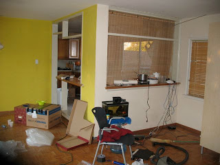
WALL REMOVAL
Removing the wall between the living area and kitchen solves a number of problems. First, it makes the house seem much bigger. Second, it makes routine activities more socially-oriented. For instance, Sean seems happier to do work (like taking dishes out of the dishwasher) because the activity is not so isolated. And now, if I have someone over for breakfast, I can cook and talk at the same time. Notice in the after picture that there is south-facing window over the sink (there is another unseen south-facing window to the right). Before, there were no south-facing windows. These windows open up the house and provide sky to look at since we live on a hill. The short wall between the living area and the kitchen is a 'bar top' that we use for eating or serving. The wood beams were not part of the original plan. They were necessary because of money-saving construction techniques used in the original house. They ended being a nice feature.
LIVING AREA
The original living area had ceiling to floor windows and a door in the middle. While this admitted lots of light (once the covered patio was removed) notice that there is no ventilation. It was like being trapped in a big glass cube. The new design has a sliding door with a screen and 3 awning windows creating much better ventilation. The sliding door is much bigger than the old door making access to the back much easier. Further, because the door is off to the side, the new space is much easier to furnish than before. The old space was extremely difficult to furnish because of the door which seemed to always be right where you'd want to put furniture. Notice that the sliding door is housed by a 'bump out'--a small, one foot area that juts slightly into the backyard. This brings focus to the dining area, visually breaks up the long wall and provides a little more space to this heavily trafficked area.
ALCOVE
On the flip side of the breakfast nook was a strange undefined area. It felt like a 'no man's land.' We used to have a desk and a chair there. This area was improved in several ways. First, when the breakfast nook was walled off, it created a much better appearance. Second, there is a small handrail which encloses the space. This tiny wall creates much better spatial definition and a more satisfying space to inhabit. Third, there is a built-in bench. The new space is designed to house a small table but could be used without one.
LIVING AREA/FIREPLACE
This area was fraught with problems. The original house had an over-scaled fireplace. "Over scale, under-furnish" was the motto of fifties design. I think the original idea was that the fireplace would be an ambiguous transitional area that could be interpreted either as entry or living area. In reality, it functioned as neither. The huge fireplace dominated the space. And sitting on the couch next to the fireplace was unpleasant. It felt like you were sitting in a hallway because of the lack of spatial definition.
In the redesign, we made the fireplace about 20% smaller and tore off the brick. A wall was built to the left of the fireplace. This small wall does miracles. It encloses the living area making it feel more comfortable and defined. Second, it creates, seemingly out of nothing, an entry area. What was once wasted space now houses a shelf unit and a bench. In the 'after' picture notice that the fireplace juts out slightly in the living area. This wasn't part of the design. It was a last-minute solution to a framing problem caused by a communication mix up. It actually turned out to be a nice feature in the end--it brings focus to the fireplace without allowing it to be overwhelming. In the 'after' picture notice that the entry area also now has a closet. This space was taken from Sean's room, an idea Maria and I had considered long ago.


No comments:
Post a Comment